商品開発2 蛍光色×箔
Product development 2 : Fluorescent color × leaf
2016.08
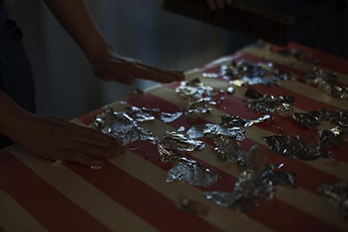
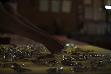
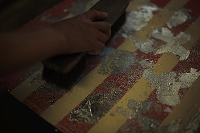
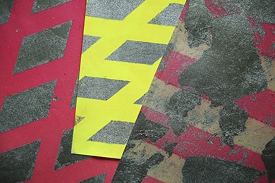
ポップな蛍光色に箔。その組み合わせに意外性を感じる人も多いのではないでしょうか。しかしこれが実に相性がいい。箔という素材の可能性の深さを象徴する取り合わせと言えると思います。もちろんただ単に蛍光塗料の上に箔を押すだけではこの新素材は完成しません。重要なのは下地となる紙に絹を貼ること。これは高度な技術を要します。そしてその上から蛍光塗料を塗布することで光沢が適度に抑えられ、カジュアルながらも品のある見栄えになるのです。規則的な柄にするか不規則にするか、あとのアレンジは自在。大きな広がりを持つ可能性を秘めた素材です。もともとスポーツウエアやシューズから着想を得たこの新素材。もしかしたらスポーツブランドのショウウィンドウなどで見られる日が、遠からず来るかもしれません。
Pop fluorescent color on leaf may let you feel the surprising combinations. But this is indeed a good combination. It can be said that its symbolized combination shows the great deep potential of the leaf. Of course, simply titling the leaf on the top of the fluorescent colors does not complete this new material. The important part is to put a silk on a paper which becomes the foundation. This requires an advanced technique. The gloss is moderately controlled by adding a fluorescent color over it, it looks good casually but projects also some elegance. Whether adding irregular or regular pattern, the arrangement depends on you. It is a material with great potential which is expanding in different ways. This new material was originally inspired by sportswear and shoes. Maybe one day, those products with this new material will be seen in places such as a show-window of sports brands